
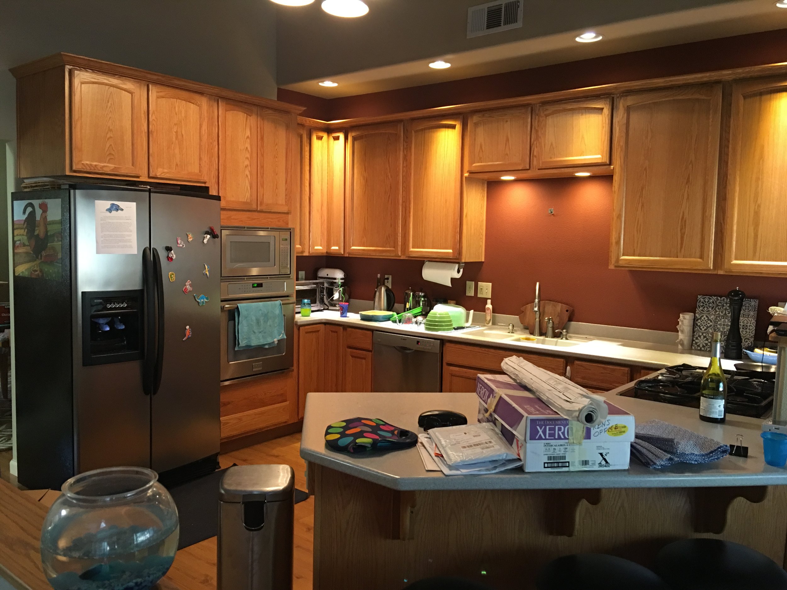
This is the “before” shot. As you can see, the kitchen started out with dark red walls. No offense to anyone with red walls in their house, but I’m more of a light and bright/blue-green-grey kind of person. Red walls are not for me…especially dark red. And these walls were more of a brown-red, as shown above. (Sorry about the mess. I took this picture right after we moved in and it’s the best one I can find right now.) It really darkened up the space. I hated it so much that it was the first thing we changed in the house. I painted over the red above the cabinets with the neutral beige paint that the previous owners had leftover from the rest of the great room.
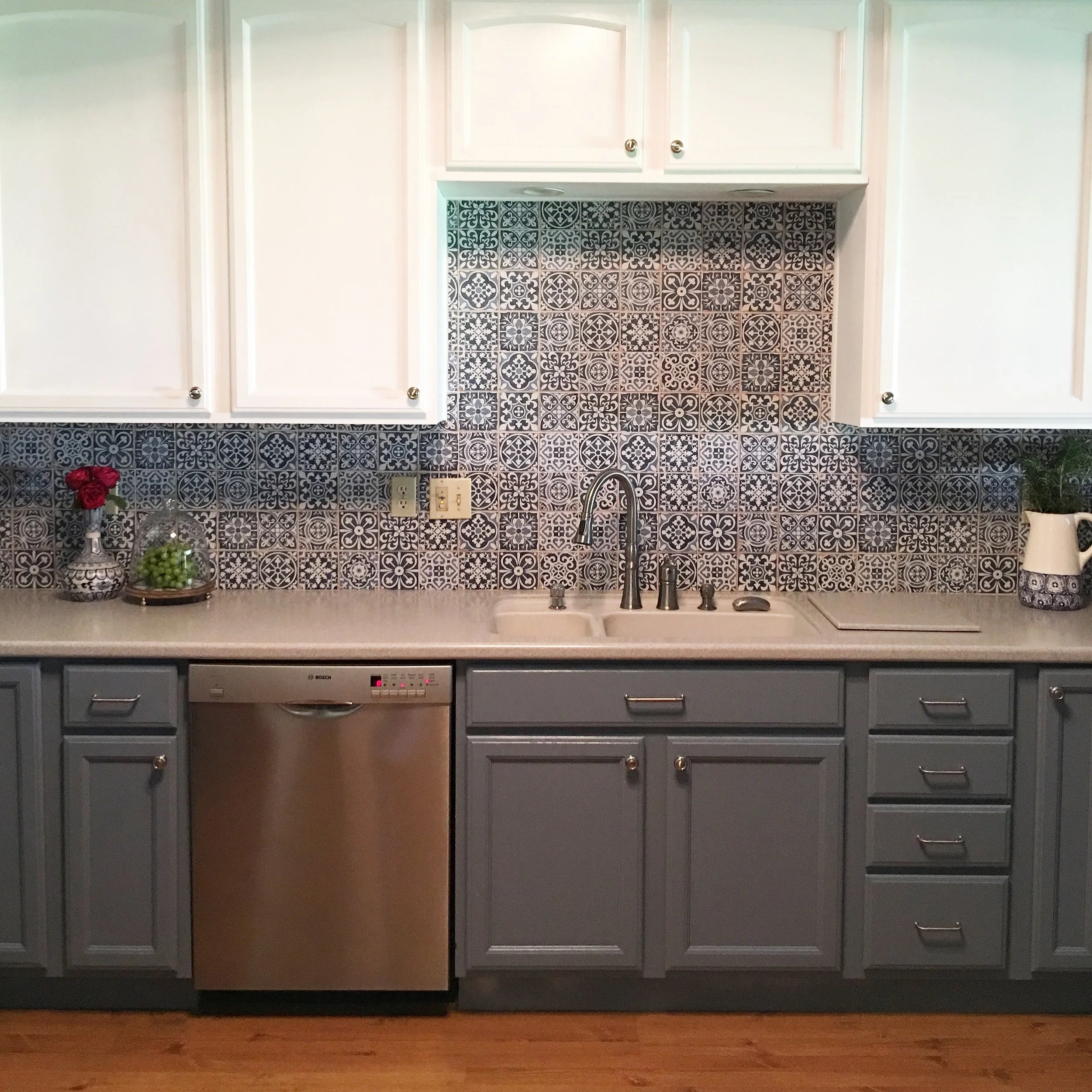
For the backsplash, I knew I wanted blue and white Spanish-style tile. I saw it in a TV kitchen somewhere and fell in love with it. What I ended up finding was a lighter, greyer blue than I had been picturing but I liked it even more.
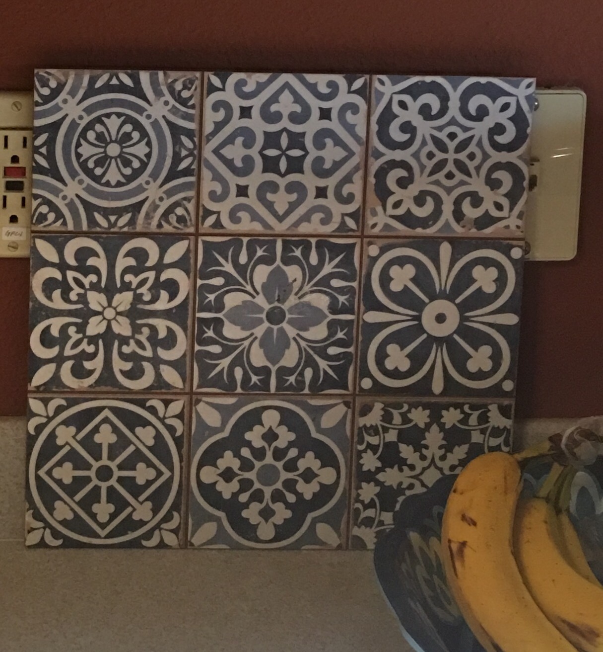
I call this piece "Tile with Bananas."
The tiles themselves are actually roughly 1ft x 1ft but they are divided into 9 squares, so you can still grout between them and have it look like each tile was put up individually. This made the job (for Scott) a lot faster and easier. I will say it was a little tough at the end to get the grout to stay inside those tiny little grooves but it worked out and I LOVE IT. Here’s Scott at the start of the job (check out those cycling calves!):
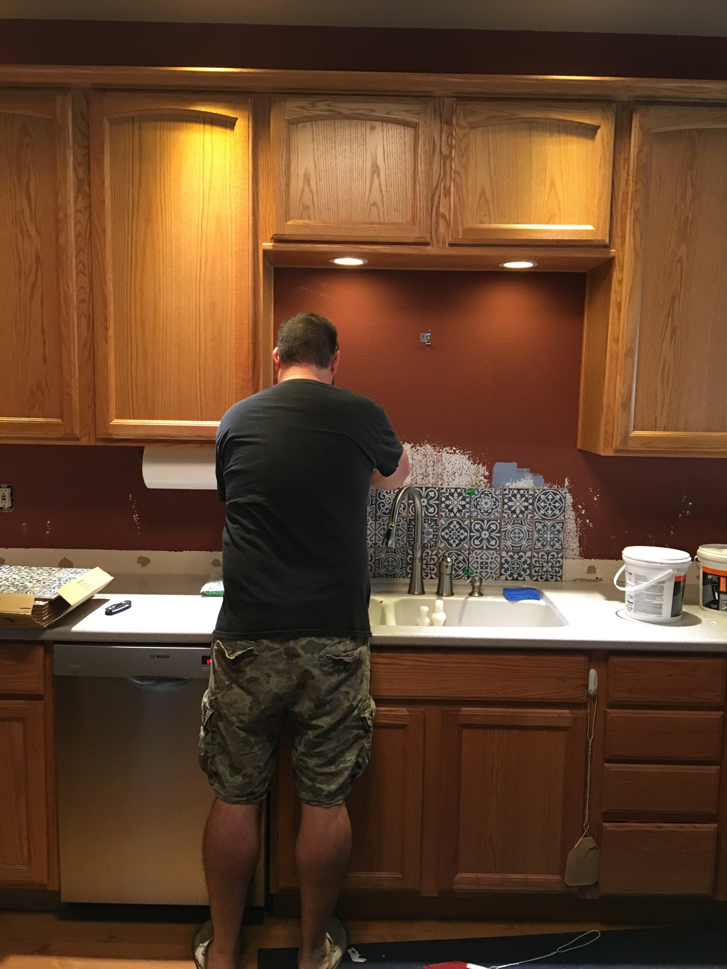
Note: we popped off that little 3-inch wide strip of Corion that was originally acting as trim at the base of the backsplash area.
The cabinets were standard honey-ish oak from the 90s even though the house was built in 2003. Good quality though. So we wanted to paint them. I didn’t want the kitchen to be too dark so we decided on white for the upper cabinets and a light-medium grey-blue for the lower. I chose a paint that would coordinate with the lighter color blue of the tile but still look grey enough to be neutral. It took me at least a dozen paint samples to decide, as evidenced by the following photo:

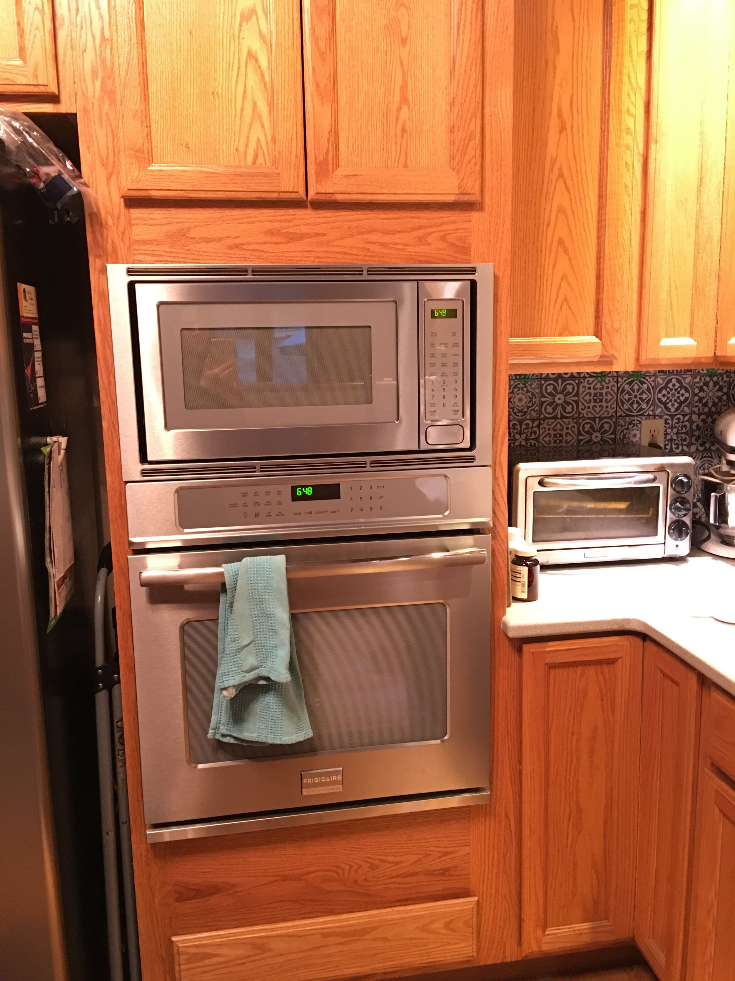
There was one tricky area around the oven/microwave where there was no clear definition between lower and upper cabinets. It’s sort of one continuous piece. We decided to keep this whole part blue-grey and I think it was the right choice.
Then once we got the cabinets painted, we loved how the grey-blue looked with the stainless steel appliances, so I chose some cabinet knobs and drawer pulls to bring more of the stainless steel element as well as protect the newly painted cabinets from constant handling.

The paint color is Sherwin-Williams Oyster Bay.
The pulls and knobs are made by Hickory Hardware. The style is Cottage. They can be found online from multiple retailers.
We also have plans to add a row of cabinets in an area not pictured. We’re more of a-little-at-a-time renovaters than whole-project-at-once people.
So…without further ado…the finished product!

Here’s the before and after:

Now I’m going to take this final moment to thank my talented, hard-working husband, Scott, who did every single bit of labor on the project, from installing the tile, to removing, sanding, priming, re-sanding, painting, re-sanding, painting, and reinstalling the cabinet and drawer faces, and finally drilling and installing the cabinet hardware.